Making the Invisible Visible
This infographic produced and distributed by the Centers for Disease Control and Prevention is a prime example of the flood of data-based infographics that are trying to bring clarity to the COVID-19 pandemic.
Seeing is believing is a mantra in the Western world. In China, the word for seeing - kandejian - has two parts. Kan means to physically see and jian means to understand what is seen. One of the biggest challenges of our data-rich world is how to bring visibility to critical concepts and issues that we can’t see because they aren’t visible to the naked eye or are so large that we can’t see them in their entirety. How can we both see and understand them? Our world is rife with such issues, from the global pandemic to climate change to the global income gap to the uncertainties and dangers of geopolitics.
This challenge is at the heart of the field of data visualization and infographics, the field that produces the maps, charts, timelines, bar graphs, tables and pictograms that enable us to make sense of the massive amount of data that floods our world.
With the coronavirus pandemic, infographics have gone in hyperdrive. Health organizations, newspapers and other organizations have churned out maps, graphs and charts that bring together complex, ever-changing global data on the number of total and new cases, total and daily new deaths and other related issues.
This dynamic interactive map showing the spread of COVID-19 was one of the first interactive infographic maps. It was produced by John Hopkins University, one of the leading sources of interactive data-based visualization of the pandemic.
John Hopkins University's Coronavirus Resource Center dashboard now is one of the most authoritative, comprehensive and widely used data-based infographic websites on the spread of COVID-19. The website goes far beyond its interactive map that tracks the number of cases and deaths. It also has timelines for each state showing the relationship between state policies and the spread or curbing of COVID-19. Infographics on the site track which states and countries have flattened the curve of new cases and deaths. This information is invaluable for policy makers in knowing when to change policies on lockdowns and mask mandates and for health professionals in planning responses to the pandemic. On the graph below for the state of Utah, the orange line shows cases increasing. In states where the trend is downward, the line is shown in green. Such visualizations help public officials and health professionals grasp immediately when a corresponding change in public policy is needed.
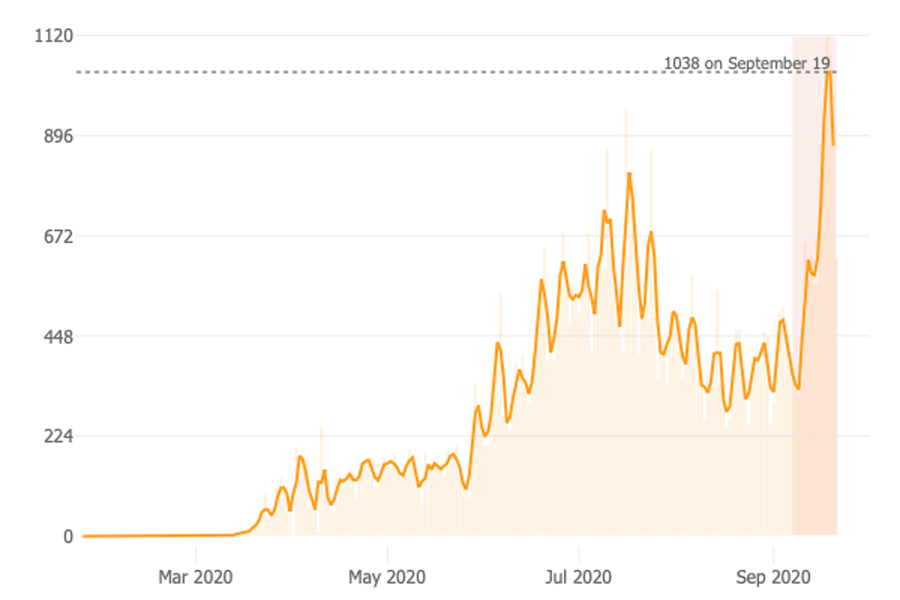
Graph by John Hopkins University, to be used for educational and academic purposes only.
Among the many other infographics on this website are ones showing a breakdown of COVID-19 data by race, where COVID-19 cases are increasing, how the outbreak is growing and how mortality differs by country.
The site includes a daily video summing up what is happening with COVID.
John Hopkins University's site is far from the only one tracking COVID-19, but its data is used by many of the most authoritative news and health organizations.
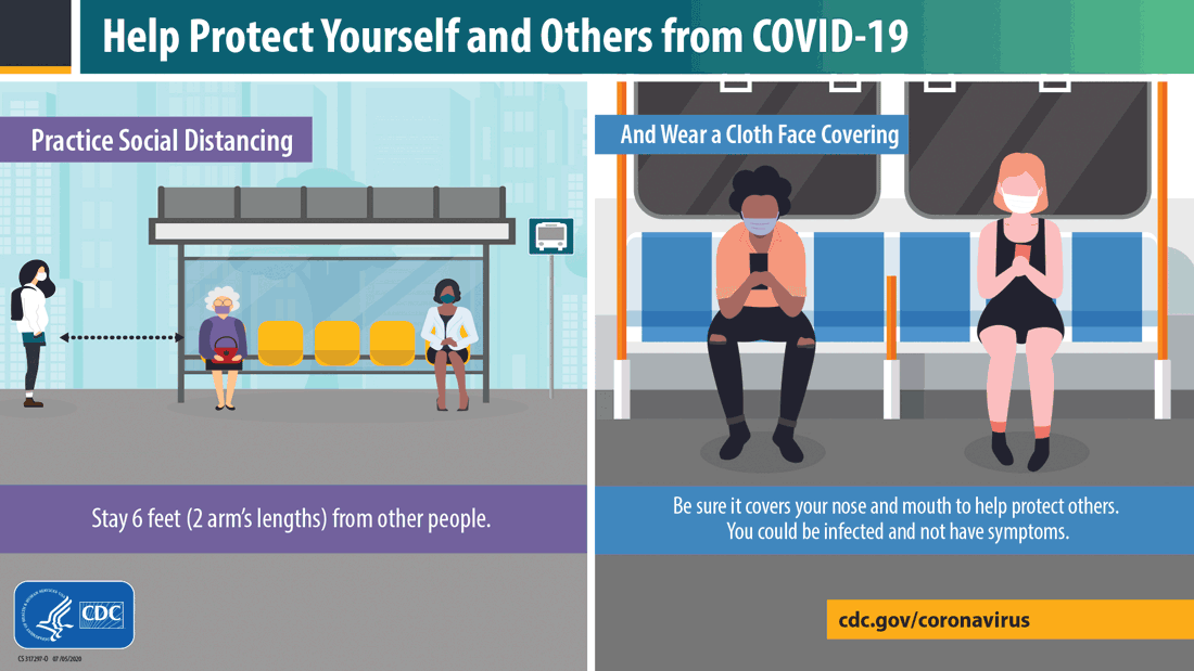
Health advice on social distancing, hand washing and mask wearing has been disseminated in bright-colored infographics by the Centers for Disease Control and Prevention and other organizations.

Infographic used by permission of the Centers for Disease Control and Prevention.
Infographic-style signs in stores and workplaces have made our phyicial world into a real-time 3D infographic that we navigate wearing masks, shying away from those around us and following large "One Way" signs on the floors of store aisles. This reorganization of public space is a throwback to the role of past pandemics in influencing architecture. In the wake of deadly cholera, tuberculosis and flu pandemics in the early 20th century, architects designed simple buildings with ample light and air, and minimalist designs replaced carved wood and upholstery that could attract bacilli-containing dust. Lightweight, washable materials were used and terraces, balconies and flat roofs were added. This minimalist aesthetic still permeates modern infographics, with their emphasis on conceptual clarity and simplicity in a complex world. Many designers are predicting that automated touchless technologies will become ubiquitous in public spaces along with easily sanitized materials, small venues for working and more open spaces for navigating with less congestion.
Phone data has been fed into interactive maps to show the effects of spreader events as infected people who attend them move on to new locations. Infographics are helping us understand how the virus spreads and the symptoms it causes. Infographics rate high risk activities – frequenting bars, attending church services and weddings – in red and orange to depict danger while showing lower risk activities in blue. Infographics help us track the progress of the dozens of vaccine studies, the disproportionate burden of the pandemic on minorities and the impact of the pandemic on school attendance. They have helped us understand how to shelter safely at home and work remotely.
Graph used by permission of the CDC.
Access to information about the pandemic has without doubt saved hundreds of thousands of lives, unlike past pandemics in which entire communities died because they didn’t know a pandemic was under way. Infographics have played a critical role in helping us to quickly understand, process and disseminate complex global data and to change our personal behaviors on a wide scale. The access to data has helped us to know quickly where key hot spots for the disease are, pull back on opening up when cases increase and allocate resources to places where they are needed.
This real-time use of data is still in its infancy in terms of controlling the virus, but long-term it can be as revolutionary for controlling pandemics as the ability to predict the path of hurricanes has been in enabling life-saving evacuations. The pandemic has made clear the transforming potential that fast access to data and a grasp on its significance can have for responding to difficult global crises.
Since the earliest cave paintings, some of which are believed to have been hunters' maps, humans have depicted large abstract concepts in infographics. The Egyptians painted or carved royal timelines on temples. The Greeks depicted their important festivals in relief on the Parthenon. Trajan’s column showed the narrative of wars in symbolic graphics. The Chinese created long scroll paintings intended to be gradually unscrolled as maps through geographic areas or journeys through historical and cultural events. They did the same with covered corridors along which one walked while viewing historical scenes in succession and tombs that had progressive chambers with murals made to appear like a walk through an imperial capital. They created star charts and decorated Buddhist caves with murals outlining the geography of the afterworld. The Christian cathedrals of Europe are three-dimensional infographics that depict Biblical history and its supposed ideological connection to the kings of Europe.
Edmund Halley created the first data-based contour map in 1701. In the early 19th century, nations began to collect and publish information about the weather, populations, and economies. Infographics in the chart, bar graph, and contour forms we know today evolved along with data collection. A French civil engineer’s map of Napoleon’s Russian campaign of 1812 displayed the dramatic loss of Napoleon’s army during its advance on Moscow and retreat.
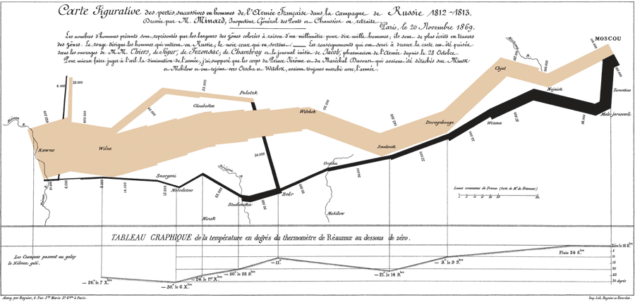
This map by Charles Joseph Minard shows the decreasing size of Napoieon's army in brown. The black line below shows its disastrous retreat and the temperatures during the retreat are shown below with a thinner line. Map in the public domain.
In 1826, Baron Charles Dupin invented the choropleth map, a map shaded to represent a characteristic in different geographic regions. A modern example is coronavirus maps that show areas with high numbers of cases in red while others are in varying lighter shades.
Scottish inventor/economist William Playfair created the first time-series line graphs, pie chart and bar chart. He plotted the price of wheat in the United Kingdom against the cost of labor, debunking the notion that wages were driving up the price of wheat by showing that wages were rising much more slowly. His goal was to use visualization to connect separate ideas. Using the first pie chart, he compared the size of various countries’ populations and tax revenues to show that the British paid much higher taxes than citizens of other nations.
Other European intellectuals used infographics to show the scope and causes of crime and diseases. Frenchman André-Michel Guerry created maps showing where crime and illiteracy were worse, disputing the common view that lower education led to crime.
Florence Nightingale revolutionized hospital care by using data on soldiers’ deaths from disease and wounds on the first coxcomb chart in 1858 to demonstrate that poor hygiene in field hospitals was killing large numbers of soldiers. Her infographic revolutionized sanitation in military hospitals, dramatically lowering death rates. During the Civil War, Abraham Lincoln strategically used maps showing areas where slavery was concentrated and where support for it was weak.
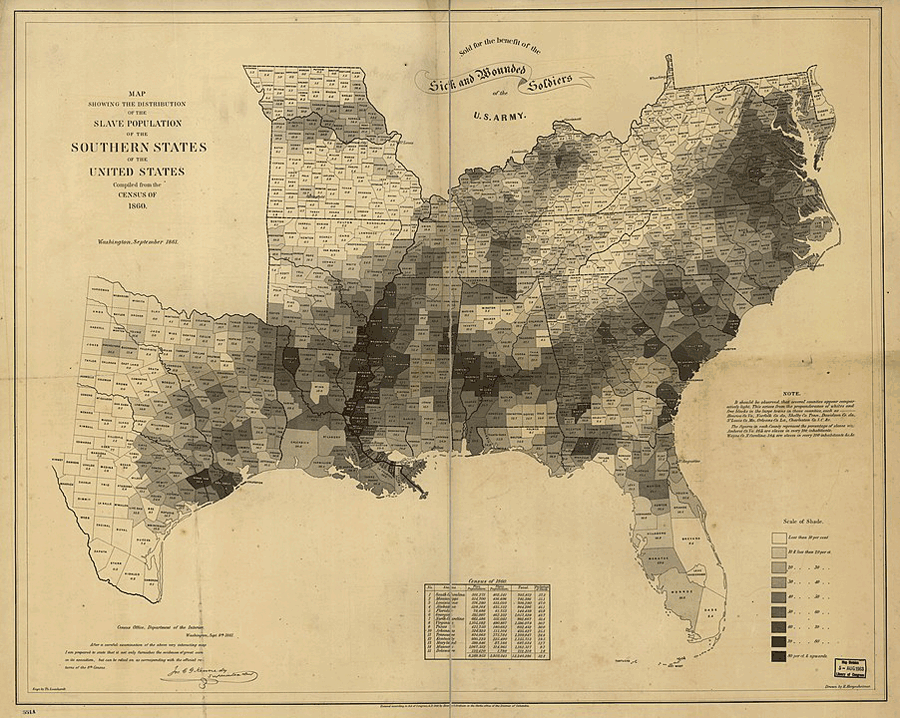
Map created by the U.S. Coast Survey in 1861 and used by Abraham Lincoln to play the Union strategy in the Civil War. In the public domain.
The Manifest Destiny vision that settled the West was moved along by maps that used army rainfall data to demonstrate that there was enough rain in the West to support livestock grazing.
Many of the visual and data elements still used in infographics were created by Alfred Leete on a poster published by the London Underground in 1915. In 1933, Harry Beck created the first map of the London Tube showing only lines to depict public transit routes and stations, integrating infographics into daily life. To handle the multi-lingual crowds at the 1972 Munich Olympics, Olt Aicher created the first of simple pictograms of people that are now ubiquitous in our airports and other public spaces. In 1972-73, NASA carried into space an infographic on plaques aimed at space aliens that showed a human male and female along with symbols for the solar system’s position in the galaxy. Graphic designer Peter Sullivan created infographics for the Sunday Times that inspired other publications to follow suit, and by the 1990s, newspapers were routinely publishing maps, bar charts, line graphs, pie charts and pictorial graphics to illustrate important political and cultural issues.
With the Internet, interactive infographics show relevant information when users click or hover over an item. This enables designers to pack a great deal of information into a compact map, timeline or chart.
Infographics have become one of the most successful ways to inform, persuade, involve and entertain audiences. Today, it is the rare organization that doesn’t use infographics on its website. They permeate our lives and have evolved into interactive phone apps that we use constantly to navigate our lives. Map, exercise, home system, car and business dashboard apps and the hardware that go with them are personalized infographics that chart our daily behavior from how we set our thermostat and water our lawns to how much we move around.
Infographics work, experts believe, because 90 percent of the information we take in is visual. Our eyes are highly efficient – able to register 35,000 visual messages per hour or 600 per minute and ten per second. Meanwhile, the average reading speed is about 300 words per minute. Most people spend just 10-20 seconds on a web page and read only 50-100 words. That attention span is dropping the more we are inundated with information.
Infographics efficiently tell stories in a small amount of time. They are the ideal blend of data, design and storytelling, allowing us to share complex information in seconds. They are liked and shared on social media three times more than any other type of content.
Some of that information is lifesaving. Long before the Internet, navigation maps were enabling sailors to navigate safely and armies to maneuver with a reduced loss of life. They helped people settle frontiers they had never seen before. Our political maps of “red” and “blue” states date to the close 2000 presidential election between Al Gore and George W. Bush, when commentators studied electoral college maps that they colored red and blue. We color undecided states purple. We know from interactive maps how segregated our schools are and how our regional cultures differ.
Infographics have created new jobs such as data journalists, who analyze large sets of data and use programming languages to make infographics quickly. Data journalists can build infographics based on sophisticated data analysis at the speed with which someone can write a news story. Readers can interact with the data in real time through filters, popups and scrolling. We see such infographics daily while watching sports, exercising, watching the news, reading business reports and following maps. Motion graphics and 3D have been integrated into infographics as well.
The result is a population who are much more data literate than previous generations were. We can automatically generate our own infographics with data we put in spreadsheet applications and emoticons in texts and messages. These tools have revolutionized the use of infographics in academia and business.
We live in a world of infographics, from road signs telling us there is construction ahead to complex global economic infographics. Infographics get our attention, help us retain and comprehend information and enable us to understand trends, patterns and predictions. Marketers use them as content marketing to sell goods and services, and businesses use them to train employees, boost productivity and streamline processes. Infographics help students be motivated to learn, clarify content and enhance their vocabularies. They cut down on the time it takes teachers to prepare lesson plans, make learning more interesting and help it reflect students’ direct experiences.
People contribute their own crowd-sourced data to infographics, helping to keep them relevant and up-to-date. Many interactive infographics allow users to extract information.
Social media sites allow infographics to spread. Some books are almost entirely made of infographics. Many infographic practices have made their way into products and games, and television has incorporated infographics extensively into viewer experiences. Many infographics are created entirely in HTML 5 and CSS web coding languages. Religious denominations use infographics to help people learn about their beliefs.
The three parts of all infographics are visual, content, and knowledge. The visual includes colors, graphics and typography. Statistics and facts are the content. Knowledge is the insight into the data.
An infographic needs to engage and appeal to its audience, be easily comprehended and remembered.
As the pandemic took off, designers created a plethora of infographics to distribute advice on how to slow the spread of the virus through social distancing, self-isolation and not stockpiling supplies. Designers created infographics on symptoms of coronavirus and how to care for people who contracted it.
Designers created infographic-type systems to help people to work from home, do schoolwork virtually, shop on-line and do other activities online while distancing. Among the biggest challenges of design has been how to create a COVID-19 exposure app that doesn’t violate privacy. Many people are reluctant to download these apps because they could track their locations.
The pandemic has generated an explosion of data to feed these infographics – number of tests performed, cases confirmed, patients recovered, and deaths as well as the impact on different populations. Media outlets, government agencies, academics and others have raced to make sense of the numbers using design and visualization tools. Maps, bar charts and line charts predominate among the forms of infographics. We are information overloaded with hourly case updates in an endless stream. In the rapidly changing situation, it is easy for infographics to mislead.
The visualization efforts have generated some erroneous infographics and models along with responsible ones. Most of the problems have occurred when people who understand data but lack expertise in epidemiology have tried to interpret the data visually.
Another problem has occurred because the complexity of the pandemic. The crisis is made up of multiple interacting components with boundaries that are hard to define and evolving, unpredictable and and always adapting. No one solution will solve the crisis and in many ways, we are having to accommodate the pandemic.
The most significant problem is that infographics and resulting decisions are based on incomplete information. We haven’t done enough testing to make the case count figures a reliable indicator of actual case numbers, which probably far exceed those reflected in the data. Some organizations are so uneasy about this that they use only charts of death rates because they are more likely to be reported than case numbers are. When data is incomplete, it is easier for designers’ biases to come out. We are all dealing with the same pandemic, but with different worldviews and values. This puts the onus on designers to collaborate with a variety of people to design viable solutions.
Designers need to consider carefully what the data seems to be saying meshes with health priorities and values. Certainty with regard to the data may never be achieved, so designers need to act carefully on the evidence that exists, acknowledge its complexity, admit ignorance when necessary and reflect collectively on what it means. They need to revise their conclusions when new evidence warrants it.
Interactive maps have helped shape the COVID-19 narrative, but they aren’t all created equal. Maps are a flat representation of something round that is projected onto a flat surface. This can cause distortions that can distort the impression made by the presentation of data on a map, so it is important to use a map projection that has been corrected to be as accurate as possible.
Many COVID-19 maps are graduated color, or choropleth, maps. These can be misleading because areas on maps are different sizes and have different numbers of people living in them. Using a particular color, like red, on a map invokes viewers’ emotions and can give people the idea that particular states are much more dangerous than others because they are bigger and therefore have more cases. Smaller states with a high rate of infection can be missed because they are low in relative case numbers and thus show up in lighter colors on the map. This can distort the truth about how much danger you are in in particular regions compared to others. The data on this type of map has to be adjusted to provide an accurate picture. Some data visualization experts say it is more useful to show the rate of cases per 100,000 people instead. This helps people to see how much more likely it is that they will contract COVID in some areas than in others.
Dot density maps, or maps that use dots to show the density of cases, are another way to show the concentration of cases in different areas. One dot equals a certain number of cases, which it is important to make clear on the map to avoid the impression that one dot equals one case. Here it works well to use totals rather than rates because the case numbers automatically render as a visual density of dots of the same size.
Another useful way to show the incidence of cases on a map is using circles that are large or small in proportion to the number of cases. The problem with these maps is that it is impossible to see small states on them and difficult to use overlapping circles as the number of cases grows. Map legends become extremely important in using symbols such as circles so that people don’t misinterpret them.
Interactive web maps have the ability to zoom and click to access popups with more information. However, they come with potential problems. Circles on maps can merge into a blob when zoomed out, and when zoomed in, they give people the idea that a circle represents an exact location rather than the center of a much larger area that it actually represents. Dot density maps have the same location problem. Choropleth maps don’t work well when zoomed in too far, because you remove the surrounding context. It’s important to restrict zoom levels to avoid extreme small or large scales that the data can’t accurately support.
It is important that COVID-19 infographics reflect the basic principles of epidemiology. A bad example is a chart that totalled the number of deaths and divided it by the known days in the pandemic to get a deaths per day figure, then compared that number to other major diseases. This approach is inaccurate because we have limited knowledge and resources for testing and treating COVID-19 compared to other diseases. This type of infographic risks understating the seriousness of COVID-19 and causing people to ignore public health guidelines.
To help solve the problem of inaccurate visualizations, some of the best teams have created ready-to-use COVID-19 datasets and made them accessible for the wide information community to use. Johns Hopkins University is a leader in this area. These assets make data from multiple sources easy to use and enable quick development of infographics.
Other problems are that government measures to combat the virus’s spread and the underlying demographics in a region have a great deal of impact on the infection rate. Thus, making comparisons on infographics between countries or states with different populations, political environments and public health systems is dubious. Italy, for example, has an older population than that of the United States, so it is problematic to extrapolate its experience to the United States.
Most people who get COVID-19 don’t die from it, and the visualizations need to reflect the numbers of recovered cases. Some infographics don’t show this factor or downplay it.
Projections of future infections should be made based on models from the World Health Organization, CDC and other public health experts whose projections typically go through peer review before being published. Data from other data scientists and statisticians should be used with caution unless they are well sourced, documented, explained and vetted by epidemiologists. These projections are complex, accounting for the virus’s behavior, people’s behavior and systems. They change over time based on new input. These factors need to be pointed out in any infographic about them.
Infographics should reference terms used and clearly define them in a footnote, the title, subtitle or text. They should be respectful of people in high risk groups and not stigmatize people in regions with a lot of cases. They need to tell a story truthfully and put the data in perspective. They carry an aura of authority and objectivity, so if they turn out to be wrong, they erode faith in public health guidelines.
Infographics have significant limitations. They can’t answer all of our most important questions such as “When will the pandemic end?” “When will I lose my job?” and “Is my family safe?” However, they can help us formulate safety guidelines for specific populations and focus on identifying and supporting the most impacted and vulnerable groups. Over time as data accumulates and becomes more conclusive, the infographics help us develop general health policies and procedures to control not just this but other pandemics in the future. Some of the data visualization expertise gained with the pandemic is portable over to other critical issues as well.
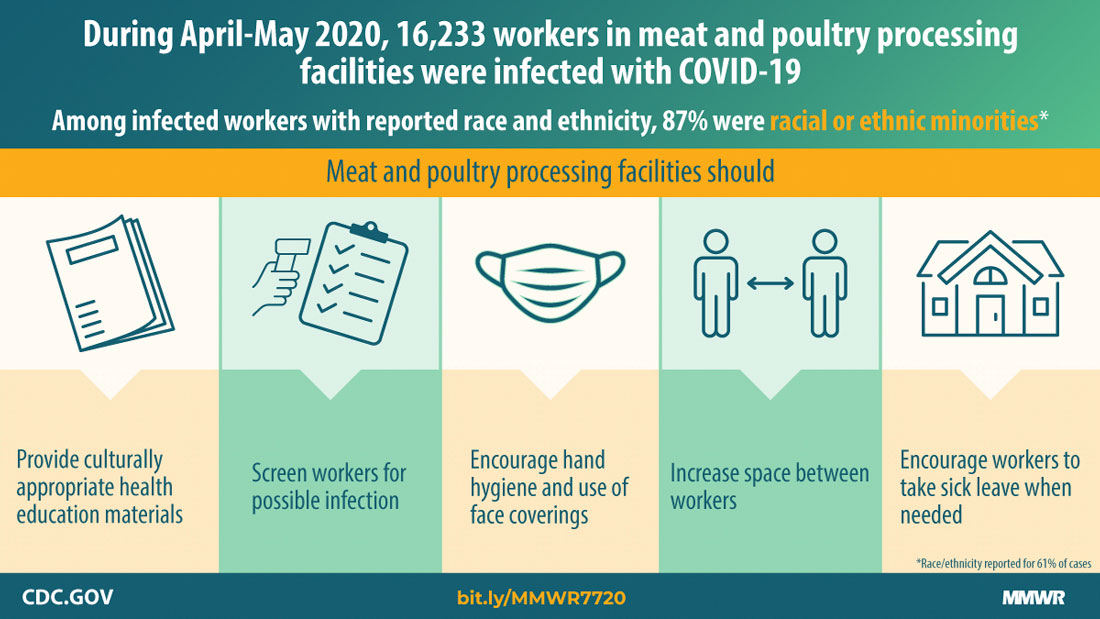
This infographic depicts guidelines for protecting workers at meat packing plants, where there have been numerous outbreaks of COVID-19.
Check out these related items
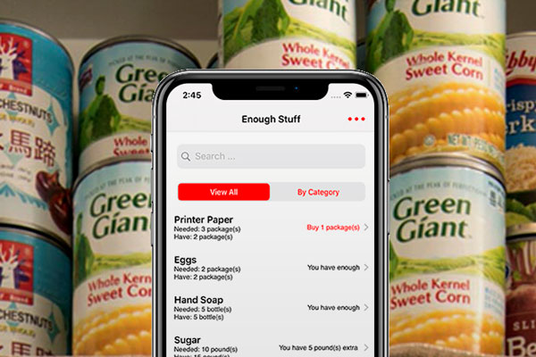
Enough Stuff App
The Enough Stuff inventory app for iOS helps you keep track of how much you have of items so you don't buy more of them than you need.
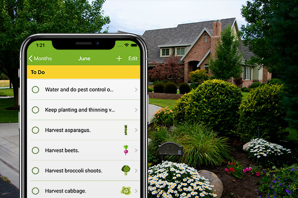
Green Thumbometer App
The all-in-one iOS app that's a gardening calendar, gardening journal, gardening to-do list and source of gardening information.
Home Gnome App
The iOS app that helps you keep track of what tasks you need to do and when to do them to maintain your home well all year long.

The Mask of Denial
New studies overwhelmingly show that masks are the most effective way to curb the pandemic and keep the economy working.

Great Global Pandemic Bake Off
Where have all the flours gone? A home baking surge has sparked a flour and yeast shortage as mills scramble to reroute supply lines.

Let’s Get to Work - From Home
Remote work is one of the best ways to limit the coronavirus and keep the economy going. Here's a guide to how to work from home.

Return of the Victory Garden
A resurgence of gardening has accompanied sheltering at home during the pandemic, invoking victory gardens of the two world wars.

Home is Where the Vacation is
Vacationing at home looks to be the main travel trend for the near future. Here are some ways to enjoy it.

Selling Happiness and Security
As businesses are scrambling to adjust to a challenging economic environment, some are thriving or recovering. Here are reasons why.